Creative Web designers always want to make their work awesome by using elements such as rounded corners, gradients, borders, etc. Implementing these designs was beyond the capabilities of old HTML and CSS, but with the new properties of CSS 3, implementing these elements has become really easy for the developers.
In this article, I'll discuss how to develop a form with input elements having a rounded shape with the use of CSS 3.
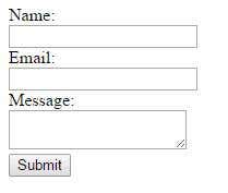
First, here's the HTML code without CSS:
<form id="form1" action="submitForm.php" method="get" >
<label for="txtName">Name:</label>
<br/>
<input type="text" name="txtName" id="txtName" />
<br/>
<label for="txtEmail">Email:</label>
<br/>
<input type="text" name="txtEmail" id="txtEmail" />
<br/>
<label for="txtMessage">Message:</label>
<br/>
<textarea name="txtMessage" id="txtMessage" ></textarea>
<br/>
<input type="submit" name="btnSubmit" id="btnSubmit" value="Submit"  />
</form>
This is what it looks like:
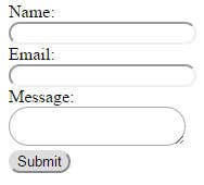
Now to give it a rounded effect, we will use the border-radius property of CSS 3. Here is the CSS code:
#form1 input[type="text"], #form1 input[type="submit"],#form1 textarea {
     -webkit-border-radius: 20px;    /* for webkit browsers */
     -moz-border-radius: 20px;       /* for Mozilla based browsers */
     border-radius: 20px;            /* standard css 3 property */
}
Let’s add some more CSS to give the form a background, make it rounded, make the input fields equal width, and give some vertical spacing between the fields. Here is the modified CSS:
#form1 {
	width: 300px;
	padding: 20px 50px;
	background:#61C794;
	-webkit-border-radius: 20px;
	-moz-border-radius: 20px;
	border-radius: 20px;
}
#form1 input[type="text"], #form1 input[type="submit"], #form1 textarea {
	-webkit-border-radius: 20px;
	-moz-border-radius: 20px;
	border-radius: 20px;
	width: 100%;
	margin-bottom: 20px;
	padding: 10px 25px;
}
#form1 textarea {
	height: 150px;
}
The form now looks like this:
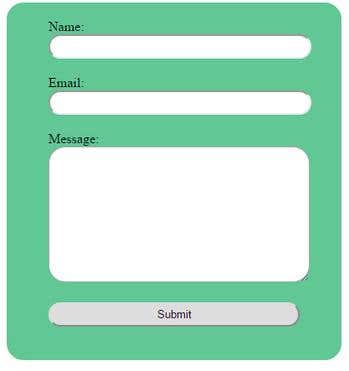
We will also use a new HTML 5 attribute named placeholder to show the labels inside the fields and remove the labels. The HTML code will be modified as:
<form id="form1" action="submitForm.php" method="get" >
  <input type="text" name="txtName" id="txtName" placeholder="Name:" />
  <br/>
  <input type="text" name="txtEmail" id="txtEmail"  placeholder="Email:"/>
  <br/>
  <textarea name="txtMessage" id="txtMessage"  placeholder="Message:"></textarea>
  <br/>
  <input type="submit" name="btnSubmit" id="btnSubmit" value="Submit"  />
</form>
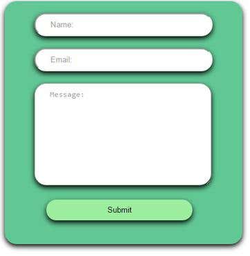
Now we will use a new CSS 3 property to give some shadow to form and input elements. The new property name is box-shadow. This property accepts 4 values as:
box-shadow: <color> <horizontal offset> <vertical offset> <blur>;
#form1 {

	width: 300px;
	padding: 20px 50px;
	background:#61C794;
	-webkit-border-radius: 20px;
	-moz-border-radius: 20px;
	border-radius: 20px;
	box-shadow: #000 0px 4px 12px;
 	-moz-box-shadow: #000 0px 4px 12px;
        -webkit-box-shadow: #000 0px 4px 12px;

}
#form1 input[type="text"], #form1 input[type="submit"], #form1 textarea {
	-webkit-border-radius: 20px;
	-moz-border-radius: 20px;
	border-radius: 20px;
	width: 82%;
	margin-bottom: 20px;
	padding: 10px 25px;
	box-shadow: #000 0px 4px 12px;
        -moz-box-shadow: #000 0px 4px 12px;
        -webkit-box-shadow: #000 0px 4px 12px;
}
#form1 textarea {
	height: 150px;
}
#form1 input[type="submit"]
{
	margin-left:20px;
	background:#9DEE9F;
	border:none;
}
There will be a slight issue here with the Chrome browser. When the cursor is inside the field, there will be outline around the field:

The outline looks awkward when the borders are rounded. To prevent this, hide the outline using following css code:
#form1 input:focus,#form1 textarea:focus{

	outline:none;
}
The final CSS code will be :
#form1 {
	width: 300px;
	padding: 20px 50px;
	background:#61C794;
	-webkit-border-radius: 20px;
	-moz-border-radius: 20px;
	border-radius: 20px;
	box-shadow: #000 0px 4px 12px;
        -moz-box-shadow: #000 0px 4px 12px;
        -webkit-box-shadow: #000 0px 4px 12px;

}
#form1 input[type="text"], #form1 input[type="submit"], #form1 textarea {
	-webkit-border-radius: 20px;
	-moz-border-radius: 20px;
	border-radius: 20px;
	width: 82%;
	margin-bottom: 20px;
	padding: 10px 25px;
	box-shadow: #000 0px 4px 12px;
        -moz-box-shadow: #000 0px 4px 12px;
        -webkit-box-shadow: #000 0px 4px 12px;
}
#form1 textarea {
	height: 150px;
}
#form1 input[type="submit"]
{
	margin-left:20px;
	background:#9DEE9F;
	border:none;
}

#form1 input[type="submit"]:active
{
	border:1px inset #fff;
	padding: 10px 23px 8px;
}

#form1 input:focus,#form1 textarea:focus{
	outline:none;
}
And the output will be: