Design a Logo for a suit company
- Status: Closed
- Prize: $220
- Entries Received: 116
- Winner: eliespinas

Contest Brief
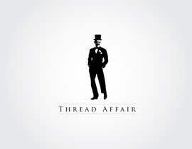
We are after a stylish logo for a tailor made men's suit company called Thread Affair (based on the style icon Fred Astaire).
We want the logo to be used for our website; business cards; as well as the tag located on the inside of the suit jackets. We have uploaded some photos of Fred himself as well as a Johnny Walker logo that we like.
We are envisioning a blackened out silhouette from one of the Fred images. Our 2 favourites are fred hat and fred hat 2. You could even look at adding some contrast to the picture and keeping the tie/pocket square or even the flower white. (not essential).
We then envisaged some sort of running writing - similar to the Jonnie Walker logo in JW pic attached - going through the image.
ideally this would go together and look like it has been sown (thread) and could even end in a neddle or ball of cotton...
we wouldn't mind a couple of logos in the repertoire - eg white on black and black on white. also one with a circle around it to be used as a 'badge.'
also very open for you to use your own creativity but hopefully the brief is quite clear.
we want the company to be stylish, young and sophisticated.
please view the versatile gent and boss hunting websites for some inspiration
good luck!
Recommended Skills
Public Clarification Board
-

creativegurus
- 10 years ago
Please rate #156 and see PM , thanks
- 10 years ago
-

shaqfis
- 10 years ago
What about our designs?
Please rate and review- 10 years ago
-

diamond7
- 10 years ago
please check #154 #162 #163 #164 #165 & #169
- 10 years ago
-

kasif20
- 10 years ago
would u like tony stark in suit...really the logo will be brilliant
- 10 years ago
-
creativegurus
- 10 years ago
Please rate #156 and see PM , thanks
- 10 years ago
-

santoshlopez
- 10 years ago
Please Rate and Review #151
- 10 years ago
-
santoshlopez
- 10 years ago
and even #152
- 10 years ago
-
kasif20
- 10 years ago
i kept the man bigger for better viewing it will be made smaller accordingly
- 10 years ago
-
kasif20
- 10 years ago
#149 feedback please
- 10 years ago
-

chipchipdesign
- 10 years ago
Hi sir, please rate and review again #116 , #117 , #118
- 10 years ago
-
chipchipdesign
- 10 years ago
Hi sir, please rate and review #166 , #117 , #118
- 10 years ago
-
shaqfis
- 10 years ago
Hi
#132 #133 please rate and review- 10 years ago
-
chipchipdesign
- 10 years ago
Hi, I'm glad to design for you. I have 3 samples special. please check # 116, 117, 118 on page 2, and give me feedback if you like, thanks
- 10 years ago
-

LucianCreative
- 10 years ago
Hi, please check out #111
- 10 years ago
-

sinke002e
- 10 years ago
- 10 years ago
-
sinke002e
- 10 years ago
- 10 years ago
-
sinke002e
- 10 years ago
hi, i made some effort here and i would be grateful for some feedback. #87 #88 #89 #90 #91
- 10 years ago
-

GFdesign
- 10 years ago
Hello Luckymenandco, Could you give me any consideration for improve design??.. #54 thank you!
- 10 years ago
-

Contest Holder - 10 years ago
can you black out the face in #73
- 10 years ago
-

makbwoy
- 10 years ago
Yes I can
- 10 years ago
-

Xatex92
- 10 years ago
please check #52 ,thanks!
- 10 years ago
-
Contest Holder - 10 years ago
Hi guapoebuenaobra I like #34 and #27 most at the moment. Can you do them so it is black not grey. Anyone else want to make any slight alterations they think might add to the design.
- 10 years ago
-
Contest Holder - 10 years ago
#2 , 3 and 20.
I like the simplicity of your design - it adds a touch of class and sophistication.
Will there be any trade mark issues using the picture of Fred Astaire as is?
Also could you work this into a landcapre version - as we would need this to be used on the inside tag of a suit that is generally a rectangle.- 10 years ago
-

mhwebservices
- 10 years ago
Due to that I designed a new logo in a way I think of the design
Thank you and I would like other serious attempts
#16 Check and please #23- 10 years ago
-
mhwebservices
- 10 years ago
check #36
- 10 years ago
-
Xatex92
- 10 years ago
Is it better now: #24 ?
- 10 years ago
-
mhwebservices
- 10 years ago
check #23
- 10 years ago
-
mhwebservices
- 10 years ago
Due to that I designed a new logo in a way I think of the design
Thank you and I would like other serious attempts
#16 Check- 10 years ago
-
Contest Holder - 10 years ago
#17 - agree you are on the right track. maybe don't limit yourself to using the circle and see what you can come up with
- 10 years ago
-
mhwebservices
- 10 years ago
hi What did you say in the design #16
- 10 years ago
-
Contest Holder - 10 years ago
Hi 17,
I love your idea but it is still not right.Can you maybe make the circle thinner and then add a pocket square to the silhouette (having a white outline).- 10 years ago
-
mhwebservices
- 10 years ago
check #16
- 10 years ago
-
Contest Holder - 10 years ago
15 is the only one who really followed the brief but is still not what we want. 2 has a nice look to it as well but I think we prefer the pic used in 15. We want to use the pics we suggested but do not want it to be recognisably Fred Astaire.
15 is good but still no right. 10 is on the right track and 6 has the right idea re the blacked out silhouette.
Good luck!- 10 years ago
-
mhwebservices
- 10 years ago
please check #16
- 10 years ago
-

Cyannetear
- 10 years ago
Please check out #8 and #9, thank you.
- 10 years ago
-

jhonlenong
- 10 years ago
#11
- 10 years ago
-
Xatex92
- 10 years ago
Hi, please check #10 ,I hope you'll like it! :)
- 10 years ago
How to get started with contests
-

Post Your Contest Quick and easy
-

Get Tons of Entries From around the world
-

Award the best entry Download the files - Easy!