Freelancer:
VaibhavPuranik
FUTURO VIVO
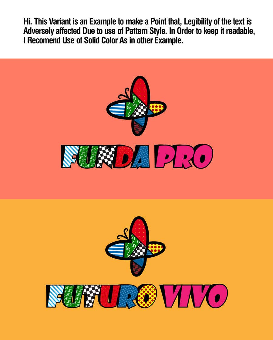
Hi. This Variant is an Example to make a Point that, Legibility of the text is Adversely affected Due to use of Pattern Style. In Order to keep it readable, I Recommend Use of Solid Color As in other Example.


