Public Clarification Board

  • Lindabf
    Contest Holder
    • 4 years ago

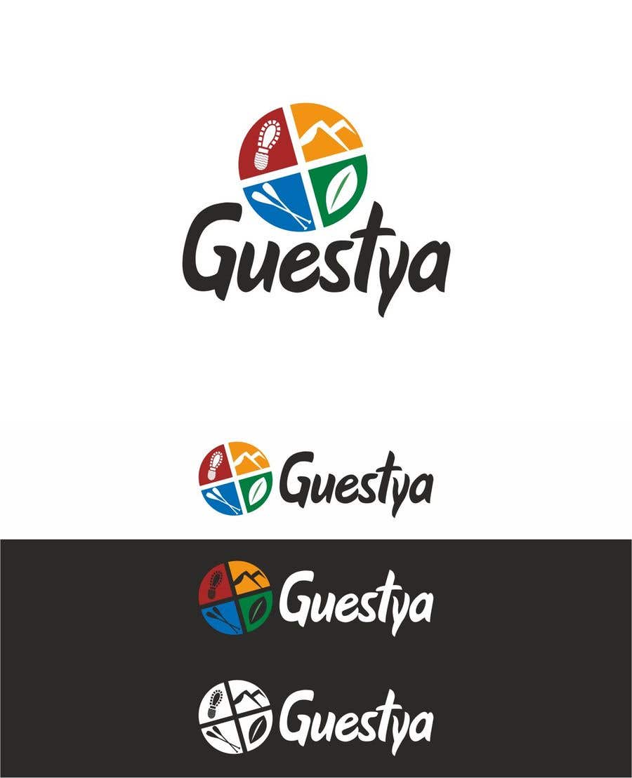
    Thank you for your efforts. I like the font, I would advise you to remplace the icons by more simple ones, for example instead of having a bed and a door in the same triangle, it would be better to have one simple icon of a guesthouse for example, other wise it sounds overcrowded with information, the same applies to the other pieces of the circle. Thank you.

    • 4 years ago
  • Lindabf
    Contest Holder
    • 4 years ago

    I like the first draft of the logo, I like the idea of the symbole, i.e. dividing the circle into 4 pieces with different icons and colors. My concern is it's rather about adventure and nature activities while we offer also accomodation booking (guesthouses) and cultural tourism activities, I would invite to make some changes to reflect those services. Also, is it possible to use another modern font. Regarding the logo style, could you use a flat style.

    • 4 years ago
    1. maxxdesign135
      maxxdesign135
      • 4 years ago

      Hi,
      Thanks for the feedback. I have made the changes as you suggest, Please check the link below and let me know what you thinks. :)
      https://drive.google.com/file/d/1u9yDYezTQFtIsAztyjtX44KXzDVX5-5e/view?usp=sharing
      Thanks

      • 4 years ago