Freelancer: Adrianm2d
Share:
Report Entry

Logistics Reduction Entry

I have attached a second image where I explain the symbols behind the logo.
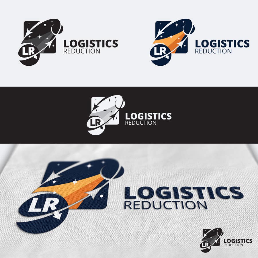
Contest Entry #69 for                                                 NASA Challenge: Design a Logo for Logistics Reduction Project

Public Clarification Board

  • nasacoeci
    Contest Holder
    • 8 years ago

    Thank you for the submission. This is great! Really like the "space" feel of the logo. Suggestion to maybe look at incorporating the moon in some aspect. Can maybe replace one of the stars with the moon? Not sure the intent of the arrow pointing back to Earth. Maybe suggest deleting?

    • 8 years ago