Freelancer:
eleopardstudios

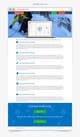
Pages UI/UX Design
I tried to focus more and more on content while keeping in mind the flat design instructions by you. In case the content is not clear in the submissions, please use this link for fullres view: https://www.dropbox.com/sh/dvbx17tmfsn6x3g/7sW7GrWi2l Please let me know your thoughts.