Freelancer: omekhu
Share:
Report Entry

Cool Packaging for Product 1

Cool Packaging for Product 1
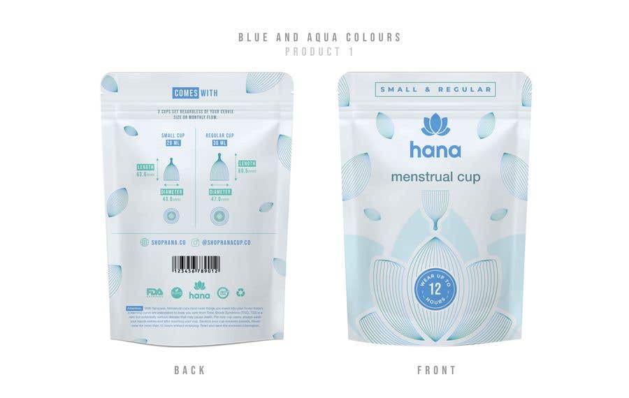
Contest Entry #83 for                                                 Rebrand a Feminine Care Product Line

Public Clarification Board

  • omekhu
    omekhu
    • 3 years ago

    I am reading the brief. will share with you the revised one. thanks

    • 3 years ago
  • maxleveragemedia
    Contest Holder
    • 3 years ago

    Apologies for the changes. We came up with a better direction and explain that before you go too far on the colors. Please pause the 3 color idea.

    So we have a simple solution here to solve the colors. I showed you this website: https://www.athenaclub.com

    We want to follow their colors for our products and website.
    Please see palette: https://ibb.co/7W0ZqV0

    1. Menstrual Cup Bag, change white background to the light pink background, the primary text and logo color will be dark blue and light blue lines (background flowers design).

    2. Cleaning Kit Bag, change white background to the light blue background, primary text and logo color will be dark blue - light pink lines/design

    3. For the Machine box, we want to see 2 versions:
    - Light Pink background with dark blue text/logo - light blue lines (design) include Dark blue Machine for mockup - https://bit.ly/3caB8lN
    - Dark blue box, with pink text/logo - light blue lines(design) - Use Pink Machine for mockup - https://bit.ly/3poJhHk

    • 3 years ago
  • omekhu
    omekhu
    • 3 years ago

    Hi, thanks for your feedback. Will share with you the revised one soon.

    • 3 years ago
  • maxleveragemedia
    Contest Holder
    • 3 years ago

    remove hana icon here to create more space

    • 3 years ago
  • maxleveragemedia
    Contest Holder
    • 3 years ago

    for more space if needed the barcode can come lower or beside the icons

    • 3 years ago
  • maxleveragemedia
    Contest Holder
    • 3 years ago

    you can remove these circles

    • 3 years ago
  • maxleveragemedia
    Contest Holder
    • 3 years ago

    These can be side by side to shorten space

    • 3 years ago
  • maxleveragemedia
    Contest Holder
    • 3 years ago

    We are very close to what we are looking for. I'm going to break down changes here for this product.

    CHANGES:
    1. Front Icon - we like the icon you have on this package of the cup, but we don't need it on the other packages as it doesn't work so well there. I'm tagging this on annotation
    2. These colors look great on the cup packaging, we can lock it in.
    3. The measurements on the back take up a lot of space, I will annotate what we need.

    • 3 years ago
  • maxleveragemedia
    Contest Holder
    • 3 years ago

    We like showing the ML, that's perfect, but dimensions can be smaller, taking up a lot of space

    • 3 years ago
  • maxleveragemedia
    Contest Holder
    • 3 years ago

    Can me make this simple, maybe with a clean outline like the front but bring everything below the zip line on this side since we are going to clean up some of the content below

    • 3 years ago

Show more comments Processing...