Update look and feel of web forms

  • Status: Closed
  • Prize: $140
  • Entries Received: 5
  • Winner: HailDuong

Contest Brief

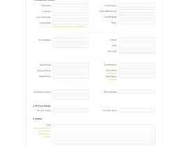
I have a form which is split in to 4 separate pages. These pages can be viewed at https://www.nominate.com.au/drifting/nominateme1.asp?eventid=60&eventtype=1

You will need to enter some details on the first page in order to move on to the next. The form is for entries to car racing.

I want a new design for these 4 pages that is more visually appealing than the design currently in place. The current design has lots of boxes and doesn't look very good.

I have web developers that can convert your design layout to html, so all I need is the design concept done in either PSD, or JPEG images. If graphics are used in the design I will require the individual images used.

Recommended Skills

Public Clarification Board

  • HailDuong
    HailDuong
    • 11 years ago

    Hi SpeedCheck, for the #5 , you may set the border of the input[type="text"] none, and the border-bottom: 1px dashed #ccc; For the "textarea", you may use a background and reapeat it vertically, just make sure to set the line-height the same as the distance between the two lines of the background. Since all of the images uploaded here are reduced in size, therefore the quality is also reduced. You can view the hight quality of #5 and #3 here: https://dl.dropboxusercontent.com/u/47571812/Design/Nominate1.png ; https://dl.dropboxusercontent.com/u/47571812/Design/Nominate2.png. Sorry for the previous message. I did not know that if I put a textarea tag inside this comment box, it would become a real tag area like below.

    • 11 years ago
  • HailDuong
    HailDuong
    • 11 years ago

    Hi SpeedCheck, for the #5 , you may set the border of the input[type="text"] none, and the border-bottom: 1px dashed #ccc; For the <textarea>, you may use a background and repeat it vertically, just make sure to set the line-height the same as the distance between the two lines of the background. Since all of the images uploaded here are reduced in size, therefore the quality is also reduced. You can view the high quality versions of #5 and #3 here: https://dl.dropboxusercontent.com/u/47571812/Design/Nominate1.png ; https://dl.dropboxusercontent.com/u/47571812/Design/Nominate2.png

    • 11 years ago
  • KateTopuzovska
    KateTopuzovska
    • 11 years ago

    Can you tell me what you think of #4 . I can change something if you want. :)

    • 11 years ago
  • HailDuong
    HailDuong
    • 11 years ago

    Hi SpeedCheck, please give me some feedback on #2 or #3 so that I will know if it's good or need to be improved, and then I can create the other pages :-)

    • 11 years ago
    1. speedcheck
      Contest Holder
      • 11 years ago

      That's OK. You don't need to create the other pages. I get the idea from the front page for your design.

      I think the design without the car in the background (number 3) is beter as the cars make the background look too cluttered.

      • 11 years ago
  • mywebworkscenter
    mywebworkscenter
    • 11 years ago

    Hi, if you want to change something on entry #1 , just leave a message.

    • 11 years ago

Show more comments

How to get started with contests

  • Post your contest

    Post Your Contest Quick and easy

  • Get tons of entries

    Get Tons of Entries From around the world

  • Award the best entry

    Award the best entry Download the files - Easy!

Post a Contest Now or Join us Today!