Freelancer: solutions88
Share:
Report Entry

Mockup1 Mad Fresh

I kept the logo minimal and typography based. I thought about using a grungier, tattoo font but that wouldn't work to well at smaller sizes. I avoided cheesy symbols but added a the horizontal lines to give an aviator vibe to evoke travel. Did different color variations on black to maintain the idea of "nightlife", but the same logo would look good black on white since it's so simple. Or white on a photo (see example). I de-emphasized travel as you said. For smaller prints (e.g. your logo on a flyer or poster) you could drop "travel" altogether since it wouldn't be readable. The font and the lines would maintain your brand identity.
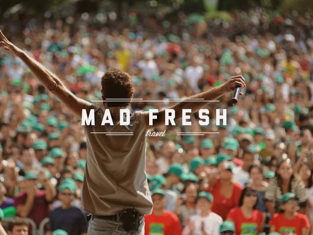
Contest Entry #46 for                                                 Vector Logo for Travel Agency

Public Clarification Board

  • solutions88
    solutions88
    • 9 years ago

    Thanks for the feedback. I'll have a think and send something over for you to look at.

    • 9 years ago
  • Shipsomnia
    Contest Holder
    • 9 years ago

    The word travel should be readable even when small..

    • 9 years ago
  • Shipsomnia
    Contest Holder
    • 9 years ago

    i like the aviator lines and the all white looks good on concert pics...

    • 9 years ago
  • Shipsomnia
    Contest Holder
    • 9 years ago

    I like your thought process. Please keep developing...

    • 9 years ago
  • Shipsomnia
    Contest Holder
    • 9 years ago

    I have just updated the brief with additional guidance. Please have a look. Thx

    • 9 years ago

Show more comments Processing...