Website Design for Wedding Portal

  • Status: Closed
  • Prize: $1500
  • Entries Received: 3
  • Winner: brnbhttchry

Contest Brief

General:
The website is for weddings.
We already had a design, but we decided to scrap it and make room for a more modern and organic look.
Website is not online.

The main audience is women.
We need the design to appear organic/fluid. Even though most of it in reality is square, we need it to appear NOT to be square :)
MODERN & ORGANIC

We will try not to influence your initial design creativity, as you are the expert here, we are only the judges.


You need to design 8 pages in your initial design.


Page 1 - Front page
Header Element:
with area for logo (Logo design not a part of this project), just write "logo here", expected size around 350x75 px, specific size is not important.

Login button (to tricker popup)

Menu (horizontal) with a designed mouseover effect
just call them OPTION 1, OPTION 2, OPTION 3, 4 and 5 (only one option needs to be designed completely with a mouseover effect)
A menu option also needs to have a roll down menu, so there are sub-options below each menu option.
The mouseover effect should be designed with a box below it with extra options. (so make the box below, part of the mouseover button effect)
The mouseover effect should also work/look fine, for menu options without extra options below it (FRONT PAGE menu option, does not have sub-menu, but still needs the mouseover effect)

Country and Language indicator
Indicator of what country has been selected
Indicator of what language has been selected


Current header can be seen at http://webhot.dk/wedding/currentheader.png
(not for inspiration)


Content Area:

Vendor Category List:
We would like a simple list of vendor categories. That would be a two tier list.
A header "VENDORS", and list of some categories
main category
sub category
sub category
sub category

main category
sub category
sub category
etc.
Expected around 6 main categories, with 3 sub-categories each.


Slideshow area (for teasers, tips, ideas, information, news etc)
Sliding images and text will appear.
Area around 450x250 px or something like that.
Make some design around it to make it blend into the design.


Article Teaser Areas
Small areas for teasers from the Article section. Would consist of a photo, header/title and some of the text from the article.
Example of current can be found at http://webhot.dk/wedding/articleteaser.png
An effect on the photo is wanted... we do not want completely squared photos.. as in the example is fine, but maybe another effect is better for the overall design.
so areas around 220x220 or something like that
Put them where you see fit. (2-4 times on the page)


End the page with standard discrete copyright notice and link to privacy policy


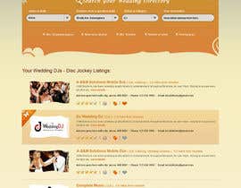
Page 2 - Vendor categories presentation/selection
We have a selection of vendor categories (Clothes, Decoration, Rentals, Entertainment etc), each category has a number of sub-categories under it.
For example, Entertainment has sub-categories like: Bands, DJ, Comedy, Live Music etc.
We want photos to illustrate a category, along with the name of the category (at least all main categories, sub-categories may not be required)

We need a good looking presentation of those categories.
Sub-categories can be displayed as a roll-down menu or similar if you want, or they can be presented right away.
Note that some categories only has a few (2-3) sub-categories, and others has more (like 13-15 sub-categories)

I (a man) actually like the example on the following link http://webhot.dk/wedding/categoryexample.png, but it is way too square and not very appealing to women.


This description field is limited to 4000 characters. Please read the full description in the attached text file.
Delivery: Photoshop files

Recommended Skills

Public Clarification Board

  • BRUSHHOUSE
    BRUSHHOUSE
    • 11 years ago

    Hey, you dont need to look after something that differs too much from another wedding forums in your layout, because design in this category depends on taste of your target group. So it should be very easy to navigate, harmonic and the colors may wake the associations with a dream wedding, so they should be in pastel tones and very decent.Im a woman and i exactly belong to you target group, i know where i would collect informations about wedding organization:)

    • 11 years ago
    1. palmio
      Contest Holder
      • 11 years ago

      Well you completely disregarded out brief about NOT being square... your design is ALL squares... we don't want it... sorry..

      • 11 years ago
  • webgik
    webgik
    • 11 years ago

    Hi. I don't see your currently website. Can you provide the link?

    • 11 years ago
    1. palmio
      Contest Holder
      • 11 years ago

      as I write in the brief.. I don't want you to be inspired by the current design, I want you to be a creative webdesigner and surprise me.

      • 11 years ago
  • stniavla
    stniavla
    • 11 years ago

    How about we design one page to impress you? After you are impressed, we are going to finish the rest page..

    • 11 years ago
    1. stniavla
      stniavla
      • 11 years ago

      looks like I'm too late to join this.. :(

      • 11 years ago
    2. softechnos5
      softechnos5
      • 11 years ago

      No one is late, i think. You got about 50-55 hours and you can make something creative in this time.

      • 11 years ago
  • brnbhttchry
    brnbhttchry
    • 11 years ago

    Hello CH,

    hope you're well!
    please check my entries #8 , #9 and #10
    differenc is mainly colour and some hover effect other than that everything is same though i like the #9 most :)
    if you like my design please feel free to send any private message to me to fix the small things if you need something.
    also if you want i can proceed with rest of the pages.
    will look forward to hear from you soon.

    Thanks
    Barun

    • 11 years ago
    1. palmio
      Contest Holder
      • 11 years ago

      finally something that is worth the time to change the current design, You have brought back the excitement in me, after being a bit disappointed with the entries submitted.

      Thank you for your entry. I will do some feedback later, I am on the way to bed... (sleepy is not a good time to do feedback)

      • 11 years ago
    2. brnbhttchry
      brnbhttchry
      • 11 years ago

      thank you so much :)) i'll do the changes based on your feedback and i'll try to do my best to reach the perfection :)
      will look forward to see the feedback from you as i can make the changes quickly and also if you can provide the feedback to my private message board would be great :) thanks a lot for your feedback.

      • 11 years ago
  • WeAreLuminosity
    WeAreLuminosity
    • 11 years ago

    Hi there, I am working in your design right now and I am really enjoying it! However I have a little doubt. Could you clarify the vendor Category List for the homepage, please. The brief says you want a two tier list with six main categories. Am I right? Thanks in adnvance, Flavia.

    • 11 years ago
    1. palmio
      Contest Holder
      • 11 years ago

      Correct. Six main categories shown in a two tier list (on the front page)
      Though I have to reject your entry. your design is the DEFINITION of being square/squares...

      I'll quote the top of our description:

      The main audience is women.
      We need the design to appear organic/fluid. Even though most of it in reality is square, we need it to appear NOT to be square :)
      MODERN & ORGANIC

      • 11 years ago
    2. patil1987
      patil1987
      • 11 years ago

      Hi palmio
      Can you draw mockup & upload it. It will be very helpful & will save time freelancers.
      Thanks

      • 11 years ago
  • softechnos5
    softechnos5
    • 11 years ago

    Hi there, Can I design homepage and 1 more page for now to just show my creativity because designing 8 pages in 8 days is very less time and the pages will be less creative. I can design the other 6 pages once you'll "love" my homepage and 1 other page design. If you agree with this then I'd love to participate in this contest. Thanks!

    • 11 years ago
    1. palmio
      Contest Holder
      • 11 years ago

      The thing is to win us over.. when the contest is over you still have 7-10 days to complete the job..
      Though we will not reward the money before all pages are completed.

      Submit as many designs as you want, and we will let you know which ones to scrap and which ones to keep working on.. there is no need to waste time designing 8 pages in a design we don't like.

      • 11 years ago
    2. softechnos5
      softechnos5
      • 11 years ago

      Yes, that's what I want wanted. Payment is not the problem in this contest, the main thing is to impress you and get this contest ;) I am gonna start from the homepage now. I'll keep you posted if there'll be any questions. Thanks!
      Please see PMB.

      • 11 years ago
  • Dzains
    Dzains
    • 11 years ago

    Hello, I am working on that project. Could you please include all main categories of vendors because I need to search for relates image?
    thank you

    • 11 years ago
    1. palmio
      Contest Holder
      • 11 years ago

      just use sample images (use the same image for all categories), we will find our own images

      • 11 years ago
  • isalabasheva
    isalabasheva
    • 11 years ago

    hello, in the brief you mention you will need 8 pages, however there are only 2 of them described. Am I missing something or is this a mistake?

    • 11 years ago
    1. palmio
      Contest Holder
      • 11 years ago

      please read the last 3 lines of the description, thank you

      • 11 years ago
  • robertlopezjr
    robertlopezjr
    • 11 years ago

    hi, what do you mean by organic, is it green or environmental style?.. fluid a is responsive web pages? meaning it should fit on any devices like tablet and smartphones. thanks

    • 11 years ago
    1. palmio
      Contest Holder
      • 11 years ago

      organic and fluid as in lines of nature, fluid like fluids (water, oil etc)... soft lines..
      not fitting smartphones etc, it will be done at a later state.

      We want it to NOT be hard lines. Even though webpages ARE square, probably because a screen is square :)... we want it to appear not square... so circles yes, triangles no .. :) makes sense?
      I would rather have a softly waved line than at straight horizontal line (just an example)

      so by organic I mean lines that nature could make up...
      More feelings, less math/trigonometry

      • 11 years ago
    2. robertlopezjr
      robertlopezjr
      • 11 years ago

      i see, more curves and rounded corner type style. thanks!

      • 11 years ago
  • kosmografic
    kosmografic
    • 11 years ago

    Hello Dear CH, Which colors you need we use to create the design , one thing more we have to only design the web pages or do you need coding also.thanks

    • 11 years ago
    1. palmio
      Contest Holder
      • 11 years ago

      We are not set on any specific color scheme. Keeping MODERN in your mind, and surprise us..
      Design only (Photoshop files), slicing and coding will be put up as an other project after this.

      • 11 years ago

Show more comments

How to get started with contests

  • Post your contest

    Post Your Contest Quick and easy

  • Get tons of entries

    Get Tons of Entries From around the world

  • Award the best entry

    Award the best entry Download the files - Easy!

Post a Contest Now or Join us Today!