Other popular skills
Featured jobs
Explore our current list of excited top featured projects.
Find contests
Unleash your talent and find freelancer contests to enter.


Other popular jobs
Find work in different languages
Enterprise
Power your competitive advantage with Freelancer Enterprise.
Field Services
Deliver expertise anywhere in the world at scale - on demand.
AI for business
Let experts in the latest AI technology transform your business.

Freelancer products
Innovation Challenges
Turn challenges into breakthroughs with the largest innovation hub.
Freelancer API
Use the Freelancer API to access a cloud workforce of skilled freelancers.
Local jobs
Get help in any location, anywhere in the world.
Freelancer services
How it works

Get ideas

Resources
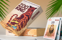
Innovative Supplement Packaging Design
Prize:
₹5,500 INR
Entries Received:
124
13 hours, 54 minutes remaining
gif, jpeg, jpg, png

Please check
Please check

Hello Contest Holder, I have submitted entry

CH, fair warning, you're going to get Many HUNDREDS of entries and the majority will be AI generated, 99% AI. These scammers put in zero effort, they paste your competition brief into an AI image tool and submit whatever it produces in seconds. No thought, no craft, no skill. Real hand crafted design takes genuine time and creativity, and that always shows in the work. This is why entries will look so similar to each other, AI is limited entirely to the words you provide and nothing more. Also watch out for participants submitting several entries back to back, a real designer simply doesn't work that fast. IF ENTRIES LOOK THE SAME, IT'S AI. ALSO PLEASE NOTE!!! AI-generated images carry zero copyright protection, leaving any third party free to replicate the design, which could lead to legal disputes over ownership or usage rights down the line.

Please check my entry sir

Please check My entry

Hi ,I have submitted Entry

Hi contest holder. I am a packaging/label design expert(check my profile). Too much AI designer there. Do you know which design made by AI? suppose i will spend 1 day for your project, but you can't responce but you will rate AI genatated design. I don't want to be disappointed.

Hi! I’ve carefully designed this entry


Download our mobile app now to ensure you never miss an update on your contests.
$150.00 USD
Posted by Britney
View More

1. Post your contest, it's fast and free
Join the thousands of entrepreneurs who are launching their contests every week and harnessing the awesome power of crowdsourcing.
2. Get tonnes of entries
You can request changes and revisions and only pay when you're satisfied.
3. Award the best entry
Award the winning entry and download the files - easy
Freelancer
About
Terms
Partners
Apps