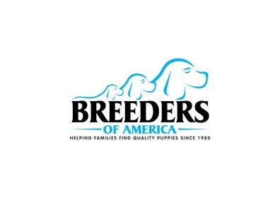
Logo Design for Breeders of America
- Status: Closed
- Prize: $290
- Entries Received: 20
- Winner: sewadufe

Contest Brief
"Helping Families Find Quality Puppies Since 1980"
Site is still being designed but its a puppy/breeder classified website breeders place ads
Target customer age 30-65 Female but I'm a guy and i'm not looking for a girly logo but middle o
Recommended Skills
Employer Feedback
“Thanks for the logo”
![]() brookglenfarm, United States.
brookglenfarm, United States.
Public Clarification Board
-

sewadufe
- 11 years ago
Hi Sir...
thank you for the trust you have chosen my design to be a winner, I will immediately send the master design file ...- 11 years ago
-

jai07
- 11 years ago
Please Check #88
- 11 years ago
-

rajaaa1987
- 11 years ago
Why rejected?
- 11 years ago
-

Contest Holder - 11 years ago
as you can see the top picks are out lines of dogs. Age group is 30 -65 not 2-9
- 11 years ago
-

dworker88
- 11 years ago
any directions for me??? :)
- 11 years ago
-
Contest Holder - 11 years ago
Ya slow down and think about the project. Quality not Quantity.
- 11 years ago
-

Designerslook
- 11 years ago
Sir please check #72 .
- 11 years ago
-
rajaaa1987
- 11 years ago
my Entry #70
- 11 years ago
-

ppludor
- 11 years ago
- 11 years ago
-
Contest Holder - 11 years ago
No.
#1 and #21 have the right ideal.- 11 years ago
-
sewadufe
- 11 years ago
please check #15 #16 #17 #18
- 11 years ago
View 1 more message
-
sewadufe
- 11 years ago
Thanks Sir...
- 11 years ago
-
Contest Holder - 11 years ago
also take a look at file uploaded: index.jpg I don't want the logo that on that file but that where the new logo will go.
- 11 years ago
-
ppludor
- 11 years ago
New try.
- 11 years ago
-
Contest Holder - 11 years ago
to much blue. :) picture over powers the words. Look at entry #1
- 11 years ago
-
ppludor
- 11 years ago
Submited a new entry, #11, feedback would be most appreciated, thank you!
- 11 years ago
-
Contest Holder - 11 years ago
wrong direction. I do want some color. That color is Blue. black lettering not all word have to be black.. The background on the website is grey so that will take care of the grey/silver.
- 11 years ago
-
Contest Holder - 11 years ago
Question is everyone able to see everyone's entries?
- 11 years ago
-
Contest Holder - 11 years ago
If so i'm liking number one. So that should give you some ideals.
- 11 years ago
-

vibin2001
- 11 years ago
Check#2
- 11 years ago
-
Contest Holder - 11 years ago
Wrong color. the has to go. Take a look at file named: index.jpg
- 11 years ago
-
Contest Holder - 11 years ago
The house has to go*
- 11 years ago
-

DesignerBeast
- 11 years ago
Hello, I happy to do some tweaking on the design as this is a mockup
- 11 years ago
-
Contest Holder - 11 years ago
top 4. to simple needs more going on and a little color. See file: index.jpg
- 11 years ago
-

yancydionne
- 11 years ago
check #4
- 11 years ago
-
Contest Holder - 11 years ago
Top 3. Dog on the left to big scale him down or use another breed. also take a look at the file i uploaded named: index.jpg
- 11 years ago
-
ppludor
- 11 years ago
I hope you are happy with #6 , but please, if you have any feedback for me regarding colors or overall arangement, please reply and i will be happy to make the changes.
- 11 years ago
-
Contest Holder - 11 years ago
Your on the right track I just don't want Red, White and Blue. Please take a look at the index.jpg file i uploaded. its the sample home page.
- 11 years ago
-
ppludor
- 11 years ago
Will do!
- 11 years ago
-
Contest Holder - 11 years ago
Take a look at index.jpg. Thats the rough draft of the front page. Your logo will replace the one that on the top left. The pictures that you see are just sample pictures. Your logo needs to fit in with everything else. thanks
- 11 years ago
-
Contest Holder - 11 years ago
Breedersofamerica.com
- 11 years ago
How to get started with contests
-

Post Your Contest Quick and easy
-

Get Tons of Entries From around the world
-

Award the best entry Download the files - Easy!