Freelancer:
catalins
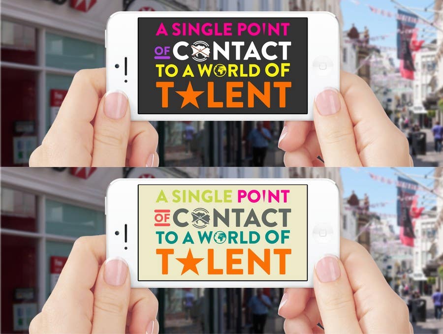
Blue Llama / iphone banner 2/2
Good day Phil, I've made the "less words" banner and I belive it looks much better then previous. The shape of Jersey island aint getting close to any letter so I tried adjusting it a little by adding the 2 waves (eighter water waves - being surrounded by it / or communication waves - hence contact) also added the flag to it otherwise if you tell people just "Jersey" they'll figure out New Jersey USA :) I've played a bit with the words and did 2 exemples with emphasis on most important and tried a light background too. Let me know what you think. Thanks :) Catalin.


