
You're now following
Error following user.
This user does not allow users to follow them.
You are already following this user.
Your membership plan only allows 0 follows. Upgrade here.
Successfully unfollowed
Error unfollowing user.
You have successfully recommended
Error recommending user.
Something went wrong. Please refresh the page and try again.
Email successfully verified.

manly vale, australia
It's currently 5:19 PM here
Joined February 17, 2012
0 Recommendations
Alicja S.
@aslazak
0.0
0.0
0%
0%
manly vale, australia
N/A
Jobs Completed
N/A
On Budget
N/A
On Time
N/A
Repeat Hire Rate
alicja slazak design
Contact Alicja S. about your job
Log in to discuss any details over chat.
Portfolio
Portfolio
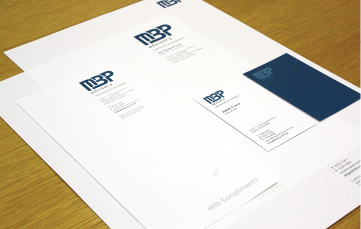

MBP Advisory Pty Limited - Corporate Identity Profile

MBP Advisory Pty Limited - Corporate Identity Profile

MBP Advisory Pty Limited - Corporate Identity Profile

MBP Advisory Pty Limited - Corporate Identity Profile

MBP Advisory Pty Limited - Corporate Identity Profile


Main Drive Kew - Marketing Print

Main Drive Kew - Marketing Print

Main Drive Kew - Marketing Print

Main Drive Kew - Marketing Print

Main Drive Kew - Marketing Print
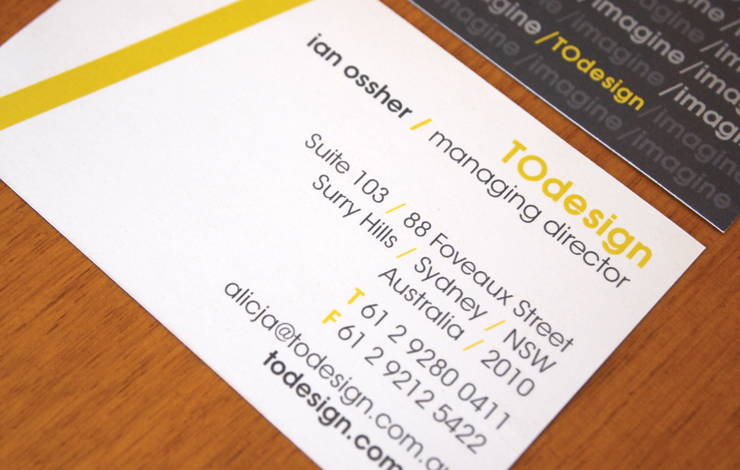

TODesign - Corporate Identity

TODesign - Corporate Identity

TODesign - Corporate Identity

TODesign - Corporate Identity


Justin Ossher - Album Artwork Apparel

Justin Ossher - Album Artwork Apparel

Justin Ossher - Album Artwork Apparel

Justin Ossher - Album Artwork Apparel

Justin Ossher - Album Artwork Apparel


Various Logos

Various Logos

Various Logos

Various Logos

Various Logos
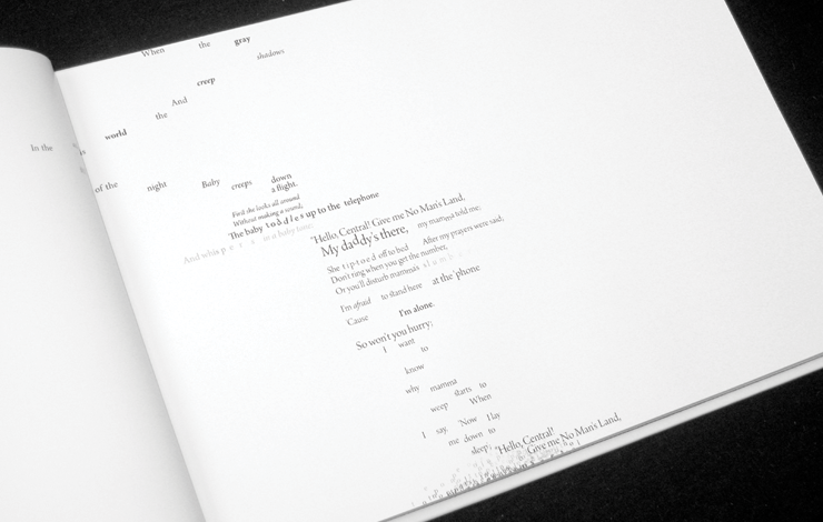

Power of Words - Print Typography

Power of Words - Print Typography

Power of Words - Print Typography

Power of Words - Print Typography

Power of Words - Print Typography
MBP Advisory Pty Limited - Corporate Identity Profile
MBP Advisory Pty Limited - Corporate Identity Profile
MBP Advisory Pty Limited - Corporate Identity Profile
MBP Advisory Pty Limited - Corporate Identity Profile
MBP Advisory Pty Limited - Corporate Identity Profile
Main Drive Kew - Marketing Print
Main Drive Kew - Marketing Print
Main Drive Kew - Marketing Print
Main Drive Kew - Marketing Print
Main Drive Kew - Marketing Print
TODesign - Corporate Identity
TODesign - Corporate Identity
TODesign - Corporate Identity
TODesign - Corporate Identity
Justin Ossher - Album Artwork Apparel
Justin Ossher - Album Artwork Apparel
Justin Ossher - Album Artwork Apparel
Justin Ossher - Album Artwork Apparel
Justin Ossher - Album Artwork Apparel
Various Logos
Various Logos
Various Logos
Various Logos
Various Logos
Power of Words - Print Typography
Power of Words - Print Typography
Power of Words - Print Typography
Power of Words - Print Typography
Power of Words - Print Typography
Reviews
Changes saved
No reviews to see here!
Experience
Graphic Designer
Nov 2010 - Feb 2012 (1 year, 3 months)
- Brand and identity design/development
- Corporate stationary design/development
- Creating designed solutions
- Production of visual layout designs in print and web
- Pre press preparation
- Participation in regular meetings and idea development
- Concept development/implementation
- Client liaisons
- Website visual layout design front end
- Website development, HTML, CSS, Javascript, PHP, backend
- iPhone visual layout design front end
Freelance Graphic Designer
Jul 2011 - Nov 2011 (4 months, 1 day)
- Production of visual layout designs in print and web
- Pre press preparation
- Participation in regular meetings and idea development
- Concept development/implementation
Junior Graphic Designer
Jan 2010 - Nov 2010 (10 months, 1 day)
- Brand and identity design/development
- Corporate stationary design/development
- Creating designed solutions
- Production of visual layout designs in print and web
- Pre press preparation
- Participation in regular meetings and idea development
- Concept development/implementation
- Client liaisons
Education
Bachelor of Design in Visual Communications
(4 years)
Qualifications
Bachelor of Design in Visual Communications (Hons)
University of Technology, Sydney
2010
University Degree
Contact Alicja S. about your job
Log in to discuss any details over chat.
Verifications
Top Skills
Browse Similar Freelancers
Browse Similar Showcases
Invite sent successfully!
Thanks! We’ve emailed you a link to claim your free credit.
Something went wrong while sending your email. Please try again.
Copy to clipboard failed, please try again after adjusting your permissions.
Copied to clipboard.
Loading preview
Permission granted for Geolocation.
Your login session has expired and you have been logged out. Please log in again.