
chaudharysparsh
India


The attached Mock up attachment is what we're looking to enhance. The page list is below. See the comments images from canva on enhancement notes.
Page list:
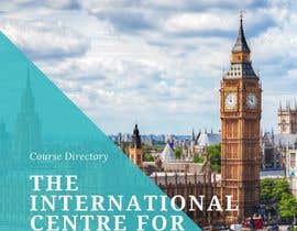
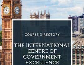
Title page
(Contents)
Intro/who we are
Our Services/What We Offer
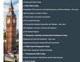
Course Directory by Subject Area
Policy Skills
Governance, Accountability and Transparency
Management, Leadership and Organisational Development
Parliamentary Knowledge
Communication Skills
Schedule of Course Dates for 2020/2021
Registration Form
Contact Us
We want a pdf where you can turn the page as if it's a real brochure.
In the file formats we needs an editable form which we can create pdf's from we can add other courses.
We have some images for you to use but we my need a couple extra sourced.
The registration section should be an editable form if this is possible such that the pdf can be sent out and filled out.
We have a very rough mock up in Canva, with some comments, but also would like you to use your creative flair:
We can't share the login details here because it gets blocked but we'll share once the project has launched.
.............................................................
Further notes:
Information on courses can be found on the website: www.govexcellence.org
For the specific programmes (listed under categories from pp 6 – 13, can we have one course per page. If there isn’t sufficient text for some of the programmes, I can provide more.
Each course category has a colour and an image associated with them – I’ve put these at the top of each section
Each course has an image associated with it: currently it is just embedded around the text
P. 14 is the course list as it appears on our website https://govexcellence.org/events/ So this is just a screenshot. I’d be grateful if the designer can do something with this – it doesn’t have to look exactly the same
Some of the pages e.g. p. 15 and p. 17 are just the info I’d like to see on there. They will need some design flair
The blue from the logo is R:5 G:52 B:116
Font on the logo is proxima nova
Font on the website is just a standard open sans, sans serif but that is just a standard, not something we have chosen
Overall look and feel/branding is official, authoritative, something akin to an international organisation.
Last, they have a previously created brochure which they really liked, which you can take design inspiration from, and also some slides, which they'd also like us to take inspiration from (the minimalism and colours) - something clean and professional with a little use of colour, but mainly using the blue.
“Really hard worker, stuck with the project until it was fully done! Really appreciated the excellent work. Apart from that a really talented graphic artist! ”
![]() PhillAsh79, United Kingdom.
PhillAsh79, United Kingdom.


Post Your Contest Quick and easy

Get Tons of Entries From around the world

Award the best entry Download the files - Easy!

