
roksanaakter1255
Bangladesh


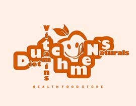
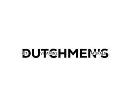
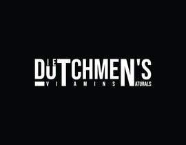
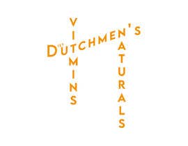
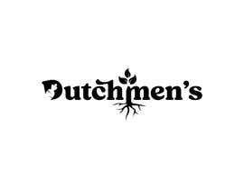
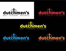
*****SINGLE COLOR*****
I'm looking for a unique, creative SINGLE COLOR logo design for my health food store named Dutchmen's. Any LOGO with just letters will be rejected, Any logo with misspelling of name will be rejected. No Automatic Logo creator files please, they will be rejected.
Key Requirements:
Single color scheme.
I'm open to your creative input but am aiming for something unique.
The logo should represent health, grocery, could possibly have a reference to a scale because we sell foods in by weight.
File will have to be delivered in Jpeg, PNG, PDF, Vectored and all 4 of those in Black, Red, Yellow, Blue and Orange.


Post Your Contest Quick and easy

Get Tons of Entries From around the world

Award the best entry Download the files - Easy!

