Design a Logo
- Status: Closed
- Prize: $61
- Entries Received: 166
- Winner: iwebgal

Contest Brief
Hello!
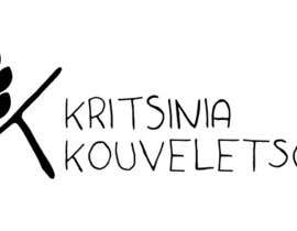
We need a logo for our new business, that will be a commerce for a specific bakery product called “Kritsini”.
We want an upper case letter “K” followed by “Kritsinia” and below “Kouveletsos”. All fonts should be taken from the same category of fonts (i.e. “K”, “Kritsinia” and “Kouveletsos” have the same fonts). Also the fonts should be the same or similar to the attached sample. The color of all letters should be black.
We would like the logo to incorporate an Ear of Wheat* in the left upper bar of K. Here you can be creative and try other similar Ear of Wheats*.
Attached are two sample files:
- LogoKristiniaKouveletsos.pdf : This is the sample logo that we want you to reproduce and ameliorate.
- LogoKristiniaKouveletsos_Alignments.pdf: This is the same logo than above and also contains the alignments that we suggest.
We would like a simple sharp logo (no shades and complicated forms), to be memorable and easily recognizable.
Winning bids will be chosen based on creativity, clarity, and punchiness.
Finally the logo should vector based, made in a way to be easy to print is several forms. (Big advertising prints, small card, stickers etc.)
Please provide the logo in high resolution. (Open Format illustrator, Coreldraw etc, and close format JPEG, PNG etc.)
Also provide the color codes you used, and the fonts.
All the best!
A.
*https://www.google.com/search?q=ear+of+wheat+vector&espv=2&tbm=isch&tbo=u&source=univ&sa=X&ved=0ahUKEwi7vOymqOXJAhUCNhoKHcM2A28QsAQIGg&biw=1280&bih=705
UPDATE 1:
Just wanted to clarify some points based on the current entries:
1. The Ear of Wheat should be much simpler that the ones we see. It should have 2-3 layers, no thin extensions.
2. The Fonts (words + ear of wheat) should be Black (no other colors) and the background White, like in entry #10, #12 and #21.
3. The Lower part of the "K" should be smaller than the upper part of the "K" like in entry #4.
4. Finally We would like to see some entries very similar to the files attached LogoKristiniaKouveletsos_Alignments.pdf LogoKristiniaKouveletsos.pdf.
UPDATE 2:
Thanks for all the entries so far! Some more clarifications:
1. All Ks should be with the same fonts (i.e., Main "K", "K" of Kritsinia, "K" of Kouveletsos.
2. Regarding the "Kritsinia Kouveletsos" please do not copy-paste our pdf. We have misaligned on purpose Kritsinia and Kouveletsos to detect copy-paste.
3. Kritsinia and Kouveletsos should be correctly vertically aligned, and correctly horizontally aligned with the Main "K"
4. Please try fonts with sharp edges (most fonts in the entries are rounded).
5. Finally it would be good to try the Ear of Wheat on the upper right part of the Main "K" (i.e. the / part of the K)
UPDATE 3:
We have extended the contest for few days.
The best entry so far is #114, we really like the fonts and the ear of wheat.
It would be great to see some similar options:
1. With slightly different ear of wheat (maybe a bit larger or not too regular forms)
2. Another type of fonts, but with similar style that should reflect the "Artisanal" part of our business.
Thanks and all the best for the final few days!
Recommended Skills
Employer Feedback
“During the contest iwebgal entries were outstanding from the rest. Great work as usual. Totally reliable freelancer, thank you!”
![]() adpap, United Kingdom.
adpap, United Kingdom.
Public Clarification Board


How to get started with contests
-

Post Your Contest Quick and easy
-

Get Tons of Entries From around the world
-

Award the best entry Download the files - Easy!