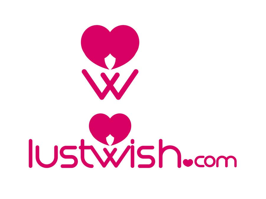
Public Clarification Board

  • okeboss
    Contest Holder
    • 10 years ago

    2) General comment: The "heart" concept is a bit inaccurate with our purpose (at least at her own), because our goal is to give adults the opportunity to fulfill their kinky fantasies, such as threesome, bondage or other alternative sexual practices. Romance is not what we really offer. Though, despite the lustful character of our site, the logo has to be elegant, classy and kinky at the same time, but not dirty. That's why, as you can see on the update of our description, we would like as icon a corset whose binders open somehow and appears the logo/name/LW. In our case, it could also be just a background frame-image on your present design, after the corrections abovementionned.
    So, if you would like to submit an additional design we will be glad to receive it because we are very satisfied from your portofolio and your present designs.
    Hope to hear back from you soon.
    Once again thank you for your excellent designs and your time.

    • 10 years ago
    1. okeboss
      Contest Holder
      • 10 years ago

      IDEA: The "opening corset" could unite the "heart" with the letter "W".

      • 10 years ago
  • okeboss
    Contest Holder
    • 10 years ago

    Thank you very much for your participation.
    I like very much your design. Though, i have to make 2 comments:1) About this design: If possible, please replace the "dot spot" on "com" with simple dot and next to it add the word "com" in vertical position, same height as letter "h". That way i think there will be a better symmetry.

    • 10 years ago