Graphic Design for Logo for Travel Mini
- Status: Closed
- Prize: $100
- Entries Received: 56
- Winner: smarttaste

Contest Brief
Travel Mini is a company that provides travel related products. We provide a one-stop shop for customers to conveniently purchase all your travel necessities.
Recommended Skills
Employer Feedback
“Created an excellent logo for the business. Highly recommended!!”
![]() fleming08, Australia.
fleming08, Australia.
Public Clarification Board
-

MKalashery
- 12 years ago
congrats smarttaste :) ...
- 12 years ago
-

theartgarage
- 12 years ago
HI please check #107 & #108 and give your feedback
Thanks- 12 years ago
-

somensato
- 12 years ago
Hi, it would be nice if you could leave some feedback on #21 , #86 and #87 so I can either go further or try other executions. Thanks.
- 12 years ago
-

megasodessa
- 12 years ago
please cheek #104
- 12 years ago
-
megasodessa
- 12 years ago
#105
- 12 years ago
-

askleo
- 12 years ago
#95
feed back please- 12 years ago
-
theartgarage
- 12 years ago
Hi,Please check #97 and leave your feedback.
Thanks- 12 years ago
-

ATIQ01673
- 12 years ago
please cheek #91. send feedback
- 12 years ago
-
MKalashery
- 12 years ago
plz don't mind the graphics still working on it, just wanted to know if you are interested in the concept ?
- 12 years ago
-
somensato
- 12 years ago
Hi, the idea of #21 is to show "MINI" inside the suitcase as the products the website sells. Please provide me your feedback. Thanks.
- 12 years ago
View 2 more messages
-

Contest Holder - 12 years ago
Try using darker shades of red. #44 font looks too much like Coca Cola. #21 looked better but the colours were too light
- 12 years ago
-
somensato
- 12 years ago
Hi, I changed the colors of the #21 . Please check out #87 .
I also did a version with the glossy suitcase, in case you like it: #86 .
I will be waiting for your feedback. Thanks!- 12 years ago
-

maslam84
- 12 years ago
plz chek my new entry thanx
- 12 years ago
-
MKalashery
- 12 years ago
what type of travelers you are targeting ?
- 12 years ago
-
Contest Holder - 12 years ago
Targeting short trip travellers and female travellers.
- 12 years ago
-
maslam84
- 12 years ago
plz check my new entry 61 &62# thanx
- 12 years ago
-

YoungFisherman
- 12 years ago
Please provide me your feedback. My entry #52
- 12 years ago
-
maslam84
- 12 years ago
plz chek my new entry thanx
- 12 years ago
-

lherhic
- 12 years ago
Hi, I just revised my entry #5 to entry #41 .
Cheers :)- 12 years ago
-
Contest Holder - 12 years ago
Hi all, it is decided that the grey menu bar will be used for the colour theme of the website. We hope that helps with your choice of colours for the logo
Cheers.- 12 years ago
-
theartgarage
- 12 years ago
Hi,Please check( #35 ) I did little modification on including the size of the letter T please provide feedback.I think this logo is working goin great with the desired look and feel.I used the color Black because its looking quite bold to attract viewers attention
Thanks- 12 years ago
-
ATIQ01673
- 12 years ago
please cheek #31
- 12 years ago
-
Contest Holder - 12 years ago
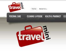
Providing a sample image of how the logo will sit on the website will improve your chances of winning (eg #11 ), it gives us a better indication of the overall look and feel of the logo.
5 Star rating - Very high chance of winning
4 Star rating - Almost there, refine it, ask questions.
Regards,
Travel Mini- 12 years ago
-

contestdesign
- 12 years ago
ANY FEEDBACK FOR MY DESIGNS???
- 12 years ago
-
Contest Holder - 12 years ago
Colours and font not quite there, positioning of the word mini doesnt sit well. Could also be read as "Mini Travel"
- 12 years ago
-
Contest Holder - 12 years ago
Great designs everyone. Keep them coming - Also keep in mind that the grey theme isnt necessarily the final colour theme I will end up with. There is also red, blue, green and silver
- 12 years ago
-
theartgarage
- 12 years ago
HI,Please check #3 Its a entirely new concept I did it for you.Please provide me feedback.Thanks
- 12 years ago
-
Contest Holder - 12 years ago
The plane that makes the T is creative - however too long. Travel isn't obvious and could be read as "ravel"
- 12 years ago
-
theartgarage
- 12 years ago
Please check my logo(#1).I hope you like it.Please provide feedback.
Thanks- 12 years ago
-
Contest Holder - 12 years ago
Suit case image looks like a cartoon and doesnt have the professional feel.
- 12 years ago
How to get started with contests
-

Post Your Contest Quick and easy
-

Get Tons of Entries From around the world
-

Award the best entry Download the files - Easy!