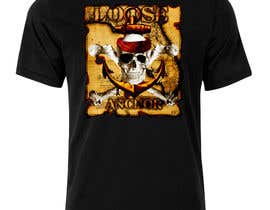
Photo edit Design for surf brand
- Status: Closed
- Prize: $90
- Entries Received: 92
- Winner: atmore12002

Contest Brief
I need a sketch/drawing edited to photo shop quality (SEE PHOTO). Something I can use as a print on a t-shirt and or logo on hats. I do not want anything cartoony. Looking for someone to take my design and add a little creativity and sharpness to it. Experiment with colors and shades. Id prefer the "Loose" lettering on the top of the anchor. The "Anchor" lettering I'd like on the bottom of the anchor. I like detailed designs. The font on the Loose Anchor part should preferably be Pirate like. I will have several other designs and logos in the future, so who ever does well will get further business.
Loose Anchor is a fishing, boating, and surf company based out of Florida. I'm open to creative ideas.
Recommended Skills
Employer Feedback
“@atmore12002 won the contest on 5 March 2014”
![]() surfnfish, United States.
surfnfish, United States.
Public Clarification Board
-

SaranyaKrish
- 10 years ago
Congrats @atmore12002 :-)
- 10 years ago
-

gauravbtn
- 10 years ago
#79 do you need any edition?
- 10 years ago
View 2 more messages
-

nathandrobinson
- 10 years ago
I'd appreciate your review of #97 #98 #99 and #100 - thanks so much! I'd love to work with you on this project!
- 10 years ago
-
SaranyaKrish
- 10 years ago
Please review and provide feedback on entry #88
Hope you like it- 10 years ago
-

pcorpuz
- 10 years ago
Hi, kindly check #86 . Thanks.
- 10 years ago
-

IAN255
- 10 years ago
#85 THANK YOU!
- 10 years ago
-
IAN255
- 10 years ago
Please check and rate #84 thank you!
- 10 years ago
-

sherire
- 10 years ago
Do you have any suggestions for improving #71 and #75
- 10 years ago
-
SaranyaKrish
- 10 years ago
#28 was my earlier entry. Had assumed you wanted a logo like design.
Please review and provide feedback on entry #46
Hope it has the T-Shirt print touch that you want- 10 years ago
-
Contest Holder - 10 years ago
46 is definitely more on track then 28, thanks you do great work
- 10 years ago
-
SaranyaKrish
- 10 years ago
Thank you so much for the ratings and comment!
- 10 years ago
-
SaranyaKrish
- 10 years ago
Please review and provide feedback on entry #56
It is a fishing rod version of entry #46
Hope you like it- 10 years ago
-
Contest Holder - 10 years ago
They both look great!
- 10 years ago
-
SaranyaKrish
- 10 years ago
Thank you so much for the rating and comments!
- 10 years ago
-
gauravbtn
- 10 years ago
First of all, please let me know whether you want it sketched by charcoal pencil or you want the kind of work i've already posted. Secondly, the lettering was just to show you how it'll look. I have a great idea for the lettering! and do you want anything else with the drawing, i can mould it how much ever you want before starting.
And also if you want the kind of work i've posted, i can do it with better finishing and can add more stuff, and it's editable!
P.S. Sorry for writing it twice, i was not sure which one you'll look at.
Thanks.- 10 years ago
-
Contest Holder - 10 years ago
The charcoal pencil may look good. Just know I'm not very familiar with what a charcoal pencil sketch would look like. I like your design a lot! The skull looks great and so does the anchor. I liked the way you wrapped the rope around the anchor also. Otherwise I'm open to any creative ideas you have. Anything that incorporates fishing, the ocean, boating surfing etc..
- 10 years ago
-
gauravbtn
- 10 years ago
you can view my work at:
https://www.behance.net/gallery/Charcoal/14035301
https://www.facebook.com/GauravAgarwalArt?ref=hl- 10 years ago
-
atmore12002
- 10 years ago
let me know if this is better #63 thanks
- 10 years ago
-
Contest Holder - 10 years ago
Yea it definitely looks better. I'd even say maybe a bit darker or throw in a shade of a different color. otherwise everything looks great
- 10 years ago
-
atmore12002
- 10 years ago
cool ill play with it. Nice wahoo there. Never caught one but i have been towed around in my kayak by a 25lbs king. There's nothing like being on the water.
- 10 years ago
-

richisd
- 10 years ago
done...look and tell me what you think tnx
- 10 years ago
-
richisd
- 10 years ago
pls review and provide feedback #64 #65
- 10 years ago
-
Contest Holder - 10 years ago
I still like the background and the skull is better. Id like the bottom of the anchor to show. If you could drop the banner below the bottom of the anchor that would be great.
- 10 years ago
-
richisd
- 10 years ago
sure no problem I'll do it immediately
- 10 years ago
-
richisd
- 10 years ago
- 10 years ago
-
Contest Holder - 10 years ago
See above reply
- 10 years ago
-

igraphicdesigner
- 10 years ago
#68. Please feedback
- 10 years ago
-
gauravbtn
- 10 years ago
Hey,
I am planning on making a charcoal sketch on an A3 paper for you, will that work?
Please revert ASAP so that i get started, as it takes time.
#48 is the idea.
Thank You.- 10 years ago
-
gauravbtn
- 10 years ago
And also if you want the kind of work i've posted, i can do it with better finishing and can add more stuff, and it's editable!
- 10 years ago
-
Contest Holder - 10 years ago
Thanks see my post above.
- 10 years ago
-

dumbfished
- 10 years ago
Hey again,
Thanks for the feedback!
I was wondering though, even though my entry didn't quite make the cut- would you be opposed to me using it in my portfolio with Loose Anchor still incorporated in.
No obligation, it's more than editable.
Kim- 10 years ago
-
Contest Holder - 10 years ago
Id have to say no on leaving the Loose Anchor name in the logo. Im sorry
- 10 years ago
-
atmore12002
- 10 years ago
thoughts on #61
I thought it looked pretty cool but may not be what you are looking for
thanks- 10 years ago
-
Contest Holder - 10 years ago
Wow looks great. You do great work and I will definitely work with you in the future. The only thing I would suggest is to make then anchor darker so it stands out more. But the design is awesome!
- 10 years ago
-
atmore12002
- 10 years ago
cool. thanks. ill work on the anchor and get it uploaded soon.
- 10 years ago
-

alex2927
- 10 years ago
Please review #29
- 10 years ago
-
Contest Holder - 10 years ago
Its a little too simple and looks kind of like clip art. Looking for more of a graphic design with depth and realistic features.
- 10 years ago
-
atmore12002
- 10 years ago
update on #32 thanks
- 10 years ago
-
Contest Holder - 10 years ago
I like this one but the bandana is a little bright. looks kind of clean for a pirate
- 10 years ago
-

parmitu
- 10 years ago
Please check entry #33 . Thanks
- 10 years ago
-
Contest Holder - 10 years ago
The anchor should be more realistic with shadowing, and the skull bones longer and ends a little smaller. Great skull though
- 10 years ago
-

alpzgven
- 10 years ago
Any feedback for my designs too maybe?
- 10 years ago
-
Contest Holder - 10 years ago
See reply above
- 10 years ago
-

LazyGod
- 10 years ago
Greetings! Please see #25
- 10 years ago
-
LazyGod
- 10 years ago
- 10 years ago
-
Contest Holder - 10 years ago
I like 38 and 42 a lot. Can you change the color of the skull to a lighter color and different color then the anchor so the two stand out from each other. Maybe the same with the lettering loose anchor so it stands out. Like the font a lot though
- 10 years ago
-
richisd
- 10 years ago
what u think about #47
- 10 years ago
-
Contest Holder - 10 years ago
I like the background a lot. The skull and bones are a little too new school for me. Looking for more realistic artwork. Id preferably like the word anchor to be on the anchor. also Id like the colors to be different with the skull and bones so they can be differentiated. Thanks!
- 10 years ago
How to get started with contests
-

Post Your Contest Quick and easy
-

Get Tons of Entries From around the world
-

Award the best entry Download the files - Easy!