Design a Logo for a Marketing Company
- Status: Closed
- Prize: $32
- Entries Received: 5
- Winner: advway

Contest Brief
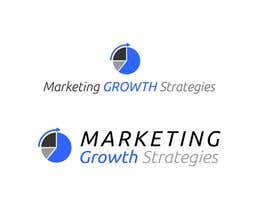
Design a Logo for Marketing Growth Strategies.
Marketing Growth Strategies is a marketing services firm combining marketing strategy, content development, and marketing technology to help our clients reach more targets, engage more prospects, qualify more leads, and close more business.
Simple is better.
See http://marketinggs.com/
Recommended Skills
Employer Feedback
“Excellent job. Designer listened to what I wanted but also came up with some great suggestions. Will use again!”
![]() drfreeman, United States.
drfreeman, United States.
Public Clarification Board
-

advway
- 10 years ago
Hi Dean, i lost my email address and i sent you my new one on your info@yourwebsite
- 10 years ago
-
advway
- 10 years ago
Check #15 please. Ready to provide you many combinations as you need to make a decision. Thanks
- 10 years ago
-

Contest Holder - 10 years ago
Please get rid of MGM (i don't use abbreviations in name). I like the other three.
On the last 2, make bottom of icon flush with bottom of text
On the second, try a Black Blue Black variation. Also try lower case Strategies and maybe font used in #14 just to compare
On the third, make icon smaller relative to text.- 10 years ago
-
advway
- 10 years ago
Pls check #17
- 10 years ago
-
advway
- 10 years ago
#14 is nr12 same idea variations. I will be back soon with nr4 theme. Thanks for feedback
- 10 years ago
-
Contest Holder - 10 years ago
I like 14 a lot also, particularly the softer fonts used, and the more muted blues used in MGM and the 4th option. Is there a way to try these type of fonts with an icon more like #15? Not sure if it can work. I do like your gears but when I showed it to a few people, they did not get it.
- 10 years ago
-
advway
- 10 years ago
Hi. #12, unique concept, dedicated only for you and your business. I hope you like it
- 10 years ago
-
Contest Holder - 10 years ago
I like the concept but had to think about it before i really liked the look. I also like #4. Can both of these be done in 2 versions ---
Version 1 is as is with text on 2 lines; version 2 is with icon on left and all text on 1 line.- 10 years ago
-
advway
- 10 years ago
Ok. Now i know what i have to do :)
- 10 years ago
-
advway
- 10 years ago
#2 is an ugly design, but if you like the idea, i can develop it, just tell me
- 10 years ago
-
Contest Holder - 10 years ago
nah, don't like the concept
- 10 years ago
-
advway
- 10 years ago
Hi. Please view #13 and tell me if you don't like font, pagination or idea . I can improve them, like usual,if you tell me exactly what you watch. Thanks
- 10 years ago
-
Contest Holder - 10 years ago
don't care for the idea
- 10 years ago
-
advway
- 10 years ago
hmm. all my logo concepts are representative ideas based. I don't know what i have to do. Just an atrective visual and good fonts or what elese?
- 10 years ago
-
advway
- 10 years ago
I can make white(simple) and blue(professional) hands if you need + business growth symbol
- 10 years ago
-
advway
- 10 years ago
If you agree, tell me if is a good hand's position angle and if it represent marketing customer orientation
- 10 years ago
-
manuel0827
- 10 years ago
#8 #9 #10 Thanks!
- 10 years ago
-

vivekshahweb
- 10 years ago
Hi,
Kindly refer #7 and give your valuable feedback.- 10 years ago
-
advway
- 10 years ago
Hi. Thanks for invite me
- 10 years ago
-

uhassan
- 10 years ago
Please Rate Entry #1
- 10 years ago
How to get started with contests
-

Post Your Contest Quick and easy
-

Get Tons of Entries From around the world
-

Award the best entry Download the files - Easy!