boria1995
Georgia

I would like a freelance to redesign my website on wix.
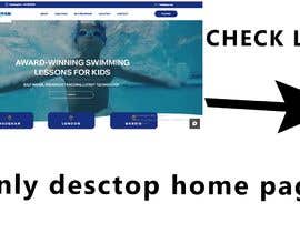
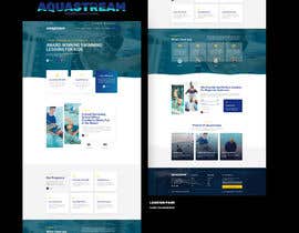
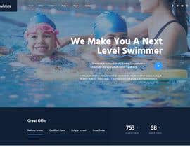
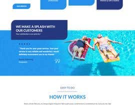
Structure should be similar to goldfishswimschool.com
All other information like branding will be provided.
The winner of the contest must be able to use WIX proficiently, and implement the design in our WIX profile. THIS IS VERY IMPORTANT!! Non wix entries will be rejected!
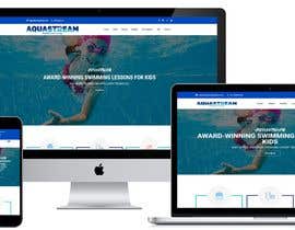
my website: Youraquastream.ca
Feedback on current website from our team, you can use some of the feedback if you feel like it helps, not required to use.
"What would you change to improve our website?" and I got the following responses:
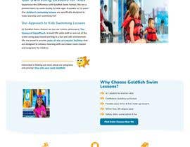
Under the contact tab, list the phone number and email otherwise they are very difficult to find. The aquapass could be better explained.
Font, graphics, update information in all sections, variety in layout
Add prices, and have consistent colours. All the different colours make it hard to read and make it seem cheap. There is also a spelling error in the Aquapass section. Maybe you guys should be using AI to write your paragraphs.
There is no pricing, the graphics are not great, the content is hard to find, the Aqua pass information is confusing. The visual needs to correlate to aquastream’s visual image - up to date, fun and engaging swim school. Also the mobile version of the website is barely usable.
As of now, the website is hard to navigate and find information - there is a lot of information in blocks (also added confusion/info because Barrie and Vaughan are mixed in together). Also, the website looks very blocky - everything feels separate.
Perhaps split up the website based on location as soon as you enter. This would clear up a lot of confusion and I think it would make it easier to get information across.
Prompt the viewer to choose a location when they first enter the site (this would make the information consistent for location)
From there, filter the website with the information based on the location (so it shows specific to the location and there will be less confusion)
Leave a heading at the end for "location" or "change location" - the viewer can then see what other locations have to offer
Suggested Headings:
Home
Keep it simple - here include photos - this should be the most eye-catching part, keep the rest of the home page simple
GIF of water on the home page makes it look really busy/too much going on (especially if the goal is to get the viewer to look at the photos/capture their attention that way)
colours are very bright (the blue with the white) ... makes it look blocky - instead use dimmer colours to make the logo/photo/info stand out
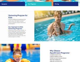
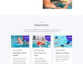
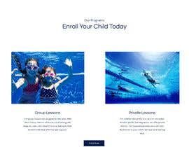
Our Programs
Keep the writing short - class ratio, basic skills learned
Point form
Prices (if you want to list the prices)
In there, mention the Aquapass
If it is titled Aquapass, visitors to the site are not going to know what that is
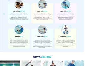
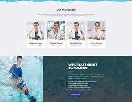
About Us
Facility
Here put all the facility information (salt water, heated pool, etc)
Pictures of the facilities
Maybe add Sofia? (if you want...)
Nick too?
FAQ
Contact Us
Contact information/contact form
Locations
So they can switch and view the other locations
Terms & Conditions "


Post Your Contest Quick and easy

Get Tons of Entries From around the world

Award the best entry Download the files - Easy!